Posts tagged: Website Critique

Website Critique: Jewelry inspired by nature

Arjeent is a unique jewelry making website. They make jewelry inspired by nature and also custom jewelry taken from a provided photo from a customer. The video website critique of their website www.arjeent.com gives suggestions on how to improve the navigation and make finding the right type of jewelry to purchase much easier for the average user.

Limited time offer Free Video Website Critique for Small Business

Overall Improvements

• The current website is generic, make it pop more and showcase that unique feel that the products have.

Homepage

• Don’t just jump directly into showing the products, explain/show the user what the website is about. Because this is so unique, you need to find that “WOW” and bring it to the homepage.
• Use the homepage to show promotions, specials, and/or even advertise the custom jewelry from photo section.
• Create a call-to-action! Don’t make your users stop and wonder what to do or where to go on your website. A call-to-action prompts the user to choose to either do this or that and explore the website.

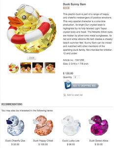
Swarovski product page example

Products

• Users are use to seeing a navigation where they can choose what product they want to shop by. Give them this option of choosing either to shop by the specific jewelry item or even by the animal type.
• Give more description to each product. This will not only help the user but will start improving your SEO.
• Under each animal that has multiple choice of jewelry items, you can say “also available in…”. This way you’re giving the user options of the jewelry type for a particular animal.
• Take a look at other well known jewelry websites and see how they showcase their products (see image of the Swarovski product page to the right).

More website critiques

Of course there are more things to dive deeply into making this site better such as search engine optimization, but this is a whole different subject and will require it’s own review.

If you’re viewing this review and want to add more suggestions, please add your comments below.

Disclaimer

The video website critique and suggestions are for you to review and take what you feel will better your business website. There’s no guarantee that the suggestions mentioned will improve your business. Design Leap is not held responsible for any negative outcome.

Website Critique: Relieve stress with Lavender products

Lavender Dreams 4ever offers Aromatherapy products that help relieve stress and tension. The video website critique of their website www.lavenderdreams4ever.com offers improvements to their homepage and suggestions for the navigation menu among other things that will make a user experience more welcoming.

Limited time offer Free Video Website Critique for Small Business

Overall Improvements

• There should be contact information in a visible location on every page. Best to include a phone number in addition to email so users can trust you better.

• Add relevant images where appropriate to break up the long text.

Homepage

• Create a call-to-action so users can immediately know what to do when they arrive on the website.

• Give more attention to your “Free Sachet give away with every purchase”. Everyone loves free stuff, make sure they know about it.

Products

• Reposition the products navigation menu so it’s easily accessible.

• Restructure how all products are displayed on the main products page. The slider makes it a little hard to tell how many products you have to offer.

Other recommendation

• Add a blog with articles about stress issues and relaxation methods. Having a blog is great to have new content on your website, which search engines love to see.

More website critiques

Limited time offer Free Video Website Critique for Small Business

Of course there are more things to dive deeply into making this site better such as search engine optimization, but this is a whole different subject and will require it’s own review.

If you’re viewing this review and want to add more suggestions, please add your comments below.

Disclaimer

The video website critique and suggestions are for you to review and take what you feel will better your business website. There’s no guarantee that the suggestions mentioned will improve your business. Design Leap is not held responsible for any negative outcome.

Website Critique: Enhancing your presentations with Presenter Media

Presenter Media is a website that offers PowerPoint templates, animations and clipart for unlimited download during an entire year subscription. It’s a great deal, but most first time visitors miss the subscription information. The video website critique shows where the website can use some improvements to make the subscription services more prominent to new visitors.

Limited time offer Free Video Website Critique for Small Business

Overall Improvements

• Basically put the focus on your subscription service. Check that your main website content is above the fold. If people can’t see it, they won’t subscribe!

Homepage

• The Flash animation at the top is not working in your favor. It’s displaying your products, but not showing what could be accomplished using your products. You are not just selling images/clipart so I believe it’s best to show what can be done using your products instead of just displaying them.
• There are so many ways you can use that top banner space, but the most effective way is to create a call-to-action for the subscription. Just take a look at other subscription based stock photo websites and you’ll notice that the subscription information is right there at the top to grab the visitor’s attention.

Screenshot of www.getharvest.com

• Another option is to polish up the look and feel of the 3 categories that you currently have blending into the text. For example take a look at what Harvest did on their homepage to focus on the subscription and below that show the 3 distinct groups that they’re targeting.

More website critiques

Limited time offer Free Video Website Critique for Small Business

If you’re viewing this review and want to add more suggestions, please add your comments below.

Disclaimer

The video website critique and suggestions are for you to review and take what you feel will better your business website. There’s no guarantee that the suggestions mentioned will improve your business. Design Leap is not held responsible for any negative outcome.

Reblog this post [with Zemanta]

Website Critique: Starting a Business Using Launchx.com

Launchx provides all-in-one business start up kits for people who are just getting started on launching their business. The video website critique of www.launchx.com offers suggestions on how to improve their website to promote their products easier and better.

Limited time offer Free Video Website Critique for Small Business

Overall Improvements

• Clean up the organization on all the pages to flow and look consistent throughout the website.

• Use better quality images and size them to look consistent and give a more professional look.

• Add the contact information where everyone can see it on every page (make it easy for people to get in touch with you).

• Call more attention to your Guarantee (assuring people that you’re there for them will make selling the products easier).

Homepage

• Add a call-to-action so people can click and discover other information on your website. Adding a promotion or a special offer can work very well here.

• Reorganize the look and order of information to what is most important first.

Products

• Product pages shouldn’t have links that take away the user from purchasing the product. Make it as less distracting as possible to eliminate people leaving the product page to view other offers.

Other recommendation

• Make the blog link directly from the navigation menu and make it look like the user never left your website.

More website critiques

Limited time offer Free Video Website Critique for Small Business

Of course there are more things to dive deeply into making this site better such as search engine optimization, but this is a whole different subject and will require it’s own review.

If you’re viewing this review and want to add more suggestions, please add your comments below.

Disclaimer

The video website critique and suggestions are for you to review and take what you feel will better your business website. There’s no guarantee that the suggestions mentioned will improve your business. Design Leap is not held responsible for any negative outcome.

Website Critique: Independent at home

Independent at home provides home medical equipment and supplies to aid individuals independence and safety. The video website critique of www.independentathome.com covers some points where the website can use some improvement to make it easier for shoppers to browse and search engines to index the site.

Limited time offer Free Video Website Critique for Small Business

Overall Improvements

• Take it up a notch into making the website more professional and organized.

• Let a professional design your business logo and use it throughout the website and all your marketing materials.

• Remove all “empty” categories. Finding an empty category makes the user think that they’re waisting their time and can move on to a competitor.

• Make all your photos the same size to make the products look more professional.

• Make “Add to Cart” button stand out to prompt action from the user.

• Add more links to your inner pages. Each category should have some text at the bottom with keywords that link to the inner pages.

• To help out the search engines, add more description text to each product. Search engines love content, give it to them!

Homepage

• The top header can be more attractive and more professional looking.

• Add a call-to-action before listing all your products. When a visitor comes to a website they have a task in mind to accomplish, steer them in the direction of what you want them to accomplish on your site.

Other recommendation

Add a blog to the website and keep adding relevant articles with keywords that link back to your product pages to boost search engine activity.

More website critiques

Limited time offer Free Video Website Critique for Small Business

Of course there are more things to dive deeply into making this site better such as search engine optimization, but this is a whole different subject and will require it’s own review.

If you’re viewing this review and want to add more suggestions, please add your comments below.

Disclaimer

The video website critique and suggestions are for you to review and take what you feel will better your business website. There’s no guarantee that the suggestions mentioned will improve your business. Design Leap is not held responsible for any negative outcome.