Brand Recognition: Creating a Custom Twitter Background
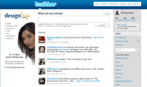
 When you have a business, you want your brand to be recognized in everything that you do. Having your business on Twitter is no different. By creating a custom Twitter background you will instantly stand out, bring credibility to your brand and leave a lasting impression to your visitors.
There are no set rules on how your background needs to look or what size it needs to be, but here are some pointers on what to do to keep that professional image.
• Keep all-important information on the left-hand side of the page.
• Always include your logo.
• Include your actual photo, this way you bring more trust and can result in more followers.
• Use colors that are similar to your brand to keep consistent.
• Use relevant images/graphics.
• Do NOT hard sell!
• Do list links of your websites, blogs, and other networking site where you can be found.
How to determine what size to make your Twitter background
 The best way is to look at your website’s analytics program and see what are your visitor’s browser screen resolutions. Take a look at the top two and based on that, you can choose what would be the best size for your background. Keep in mind that the smaller the resolution, the less space you have for design.
The best approach to designing a custom Twitter background
Create everything in layers (it’s easier to make changes when you’re working with layers). This does not mean that you need to have Photoshop to do this. There are many free alternatives to Photoshop that perform just as great. I am recommending the “Phoenix” by Aviary.com as it’s very similar to Photoshop.
• Your first layer should be the main image, color or gradient that will serve as the pallet for your design.
• Next few layers don’t have to be in this order. You can start with the top banner that’s where you can add another color or gradient. This is where the Twitter logo and menu will sit so keep in mind the visibility when choosing colors.
• The last and most important step is to add your information to the left-hand side of the page and it’s best if you place this on it’s own layer.
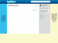
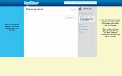
Use one of these templates as a guide on proper placement of your information
|
1024 x 768 Template |
1280 x 800 Template
|
Quick tip: Do NOT place important information below 600 pixels in height no matter the screen resolution size. This is because some users might have extra tool bars on their browser window, which pushes all the information down.
After you download the background template, open it in the design program of your choice and use it as bottom layer to server as a guide for you to place your information. When you’re done with your design, delete the layer with template. Save your design as GIF, JPG, or PNG format. Then go to your twitter page and follow these steps:
• Select Settings
• Choose the Design tab
• Click on Change background image
• Upload your image
• Make sure that tile background is NOT checked
• Save changes
That’s it you’re done!


