In Photoshop, a checkered background represents transparency, when you save your work, the checkered pattern will not show. The only way to remove it, is to add an actual background on the layer under your image. Here’s a tutorial of How to Remove Checkered Background in Photoshop
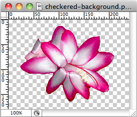
Checkerboard pattern in Photoshop

Background removed
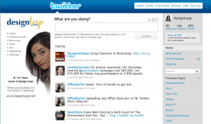 When you have a business, you want your brand to be recognized in everything that you do. Having your business on Twitter is no different. By creating a custom Twitter background you will instantly stand out, bring credibility to your brand and leave a lasting impression to your visitors.
There are no set rules on how your background needs to look or what size it needs to be, but here are some pointers on what to do to keep that professional image.
• Keep all-important information on the left-hand side of the page.
• Always include your logo.
• Include your actual photo, this way you bring more trust and can result in more followers.
• Use colors that are similar to your brand to keep consistent.
• Use relevant images/graphics.
• Do NOT hard sell!
• Do list links of your websites, blogs, and other networking site where you can be found.
How to determine what size to make your Twitter background
 The best way is to look at your website’s analytics program and see what are your visitor’s browser screen resolutions. Take a look at the top two and based on that, you can choose what would be the best size for your background. Keep in mind that the smaller the resolution, the less space you have for design.
The best approach to designing a custom Twitter background
Create everything in layers (it’s easier to make changes when you’re working with layers). This does not mean that you need to have Photoshop to do this. There are many free alternatives to Photoshop that perform just as great. I am recommending the “Phoenix” by Aviary.com as it’s very similar to Photoshop.
• Your first layer should be the main image, color or gradient that will serve as the pallet for your design.
• Next few layers don’t have to be in this order. You can start with the top banner that’s where you can add another color or gradient. This is where the Twitter logo and menu will sit so keep in mind the visibility when choosing colors.
• The last and most important step is to add your information to the left-hand side of the page and it’s best if you place this on it’s own layer.
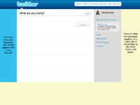
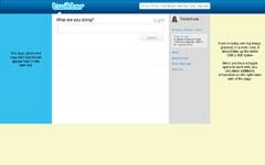
Use one of these templates as a guide on proper placement of your information
|

1024 x 768 Template
|
1280 x 800 Template
|
|

|

|
Quick tip: Do NOT place important information below 600 pixels in height no matter the screen resolution size. This is because some users might have extra tool bars on their browser window, which pushes all the information down.
After you download the background template, open it in the design program of your choice and use it as bottom layer to server as a guide for you to place your information. When you’re done with your design, delete the layer with template. Save your design as GIF, JPG, or PNG format. Then go to your twitter page and follow these steps:
• Select Settings
• Choose the Design tab
• Click on Change background image
• Upload your image
• Make sure that tile background is NOT checked
• Save changes
That’s it you’re done!
To remove white background from logo successfully, you need to make sure you save it correctly. Save only as .png or .gif file. To get a better quality save as .png. Saving as a .jpg or .jpeg file will automatically add a white background even if you have removed it.
See how to remove the background of an image in Photoshop using the Magic Wand tool
I use Photoshop on a daily basis, but not everyone is a designer nor can everyone afford it. Here’s a list of few free web based alternatives to Photoshop where you can either use them to create a new graphic from scratch or just do basic photo editing from your existing photos. I haven’t really used them to test all the features and tools, but I came up with the pros and cons based on my quick evaluation. First three are similar to Photoshop in a sense that you can create a graphic from scratch or open your own photo to work with. The last three are basically photo editing, meaning you will need to upload a photo to work with it.
 |
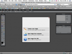
http://www.pixlr.com/editor/ – The interface looks almost identical to Photoshop. Has all the features that you would need to do basic photo editing. Recently released, so it’s still in its growing phase.
Pro: Loads really fast.
Con: Doesn’t have rulers or guides. |
 |
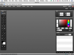
http://www.splashup.com/ – Looks similar to Photoshop, but is a little tricky to use. There are no rulers here either.
Pro: Interface similar to Photoshop.
Con: A little tricky to use. |
 |
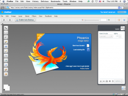
http://www.aviary.com (Phoenix Image Editor) – Was happy to see that this one has rulers and I can drag guides. Also has tutorials and explanations of the tools.
Pro: Easy to use, has lots of tutorials.
Con: Can’t think of any cons. |
 |
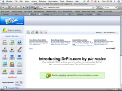
http://www.drpic.com/ – If you’re use to Photoshop, this one is a little hard to work with.
Pro: Has a batch resize feature (in more tools section below all the main tools).
Con: Takes a while to load, also has annoying ads. |
 |
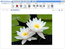
http://fotoflexer.com/ – Another photo editor that doesn’t really look like Photoshop but is really easy to use. Has ads, but if you click on the Full Screen mode all you see is the editor and no ads or browser toolbar. Have easy-to-follow tutorials to help you along.
Pro: Easy to use, great for scrapbookers.
Con: Can’t think of any cons (but I haven’t tried everything). |
 |
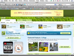
http://www.picnik.com/app – Another one that’s great for scrapbookers. Of course anyone can use it that needs to edit their photos, lots of cool features and effects.
Pro: Easy to use, looks like you can spend hours playing with all the features.
Con: Not really a con, but you’ll need to upgrade to premium to use all the extra features. |
There are a lot more, but these are the few that stood out. If you’ve used any of these and have your own pros and cons please leave a comment to share those with everyone.
There’s a huge difference when preparing images for web use and preparing images for printing purposes. The major difference is in color type and resolution.
How is CMYK different from RGB
Images online use color combination known as RGB (Red, Green, Blue) and images that are printed use color combination know as CMYK (Cyan, Magenta, Yellow, Black). What this basically means is that the colors of an image/graphic that you see on your screen will NOT be exactly the same as when you print that image/graphic. Images on the monitor will appear lighter then the once that are printed. This is due to the monitor being lit from the back to light up your screen. The colors that are seen on screen will vary from one monitor to the other because each individual sets their monitor to their liking.
Image resolution, 72dpi vs. 300dpi
Resolution for images online is recommended to be no more than 72dpi (dots per inch) vs. resolution for images that are printed is recommended to be at least 300dpi. As you can see there’s a big difference between 72 and 300. Basically, the dpi will determine how clear the image will look and this is most concerned for printed images. Web images need to be on the low scale because the resolution affects the loading time. Online users don’t have patience for an image to load. The smaller the image, the faster the website/blog/email will load.
Preparing your images for online use
Best practice is to prepare the image the size that you need it to be before you upload it online. Uploading a huge image to your website and then scaling it, will NOT make the physical image smaller, it will only appear smaller, thus still slow down the loading time. Take look at this short video on how to make your image smaller using FotoFlexer.com
Once you’ve made your images physically smaller, you can go ahead and use them online.
Preparing your images for printing
It’s best to have a professional prepare your images for printing. There are a lot of things to consider when getting your images ready for print.


 The best way is to look at your website’s analytics program and see what are your visitor’s browser screen resolutions. Take a look at the top two and based on that, you can choose what would be the best size for your background. Keep in mind that the smaller the resolution, the less space you have for design.