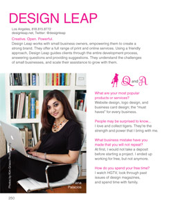
 I’m excited to announce that I, Yiana Palacios am being featured in the Intelligentsia section of the CRAVE Los Angeles 2010 Guidebook and I’m giving one away.
To Enter: Simply fill in the form CRAVEla Guidebook Giveaway
CRAVE Los Angeles 2010 guidebook is filled with businesses and stories of inspiring women owned businesses. From shopping and dinning to business and health this is the ultimate guidebook to the places women CRAVE in Los Angeles.
The Intelligentsia section highlights business-to-business entreprenesses, including coaching, marketing and public relations, photography, business consulting, and design services. I’m one of more than 125 women who are featured in the premier issue of this guidebook.
Do you ever need to know the size of a window, a banner, or a column on a website, but have no idea how to measure it? Well, if you’re using the Firefox browser, now you can download the MeasureIt add-on.
Once you download the MeasureIt add-on, you’ll notice a  ruler icon on the lower left-hand corner of your browser window. To measure anything on your screen follow these simple steps:
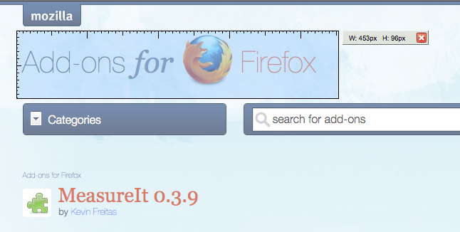 Click on the ruler icon and your mouse pointer will change to a plus sign.
- Click and drag your mouse over anything on your screen to measure it. (You’ll notice that while you drag you get a light blue box that looks like a ruler and a measurement in pixels is shown to right.)
- That’s it, when done just click on the ruler icon on the bottom of your screen again to exit.
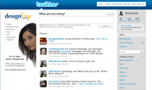 When you have a business, you want your brand to be recognized in everything that you do. Having your business on Twitter is no different. By creating a custom Twitter background you will instantly stand out, bring credibility to your brand and leave a lasting impression to your visitors.
There are no set rules on how your background needs to look or what size it needs to be, but here are some pointers on what to do to keep that professional image.
• Keep all-important information on the left-hand side of the page.
• Always include your logo.
• Include your actual photo, this way you bring more trust and can result in more followers.
• Use colors that are similar to your brand to keep consistent.
• Use relevant images/graphics.
• Do NOT hard sell!
• Do list links of your websites, blogs, and other networking site where you can be found.
How to determine what size to make your Twitter background
 The best way is to look at your website’s analytics program and see what are your visitor’s browser screen resolutions. Take a look at the top two and based on that, you can choose what would be the best size for your background. Keep in mind that the smaller the resolution, the less space you have for design.
The best approach to designing a custom Twitter background
Create everything in layers (it’s easier to make changes when you’re working with layers). This does not mean that you need to have Photoshop to do this. There are many free alternatives to Photoshop that perform just as great. I am recommending the “Phoenix” by Aviary.com as it’s very similar to Photoshop.
• Your first layer should be the main image, color or gradient that will serve as the pallet for your design.
• Next few layers don’t have to be in this order. You can start with the top banner that’s where you can add another color or gradient. This is where the Twitter logo and menu will sit so keep in mind the visibility when choosing colors.
• The last and most important step is to add your information to the left-hand side of the page and it’s best if you place this on it’s own layer.
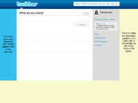
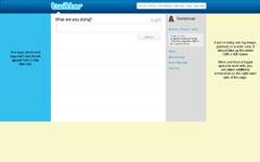
Use one of these templates as a guide on proper placement of your information
|

1024 x 768 Template
|
1280 x 800 Template
|
|

|

|
Quick tip: Do NOT place important information below 600 pixels in height no matter the screen resolution size. This is because some users might have extra tool bars on their browser window, which pushes all the information down.
After you download the background template, open it in the design program of your choice and use it as bottom layer to server as a guide for you to place your information. When you’re done with your design, delete the layer with template. Save your design as GIF, JPG, or PNG format. Then go to your twitter page and follow these steps:
• Select Settings
• Choose the Design tab
• Click on Change background image
• Upload your image
• Make sure that tile background is NOT checked
• Save changes
That’s it you’re done!
On random Tuesdays I send out a Tweet that I offer to design a free custom twitter background for one small business owner or start-up company. Follow Design Leap so you won’t miss your opportunity.
To enter: leave a comment on this post and include the following:
- your full name
- business name
- website address
- twitter name
- why I should choose you to design your twitter background
The chosen person will supply images and text and agree to have a small “Designed by and my logo” on their custom twitter background. One entry per person please.
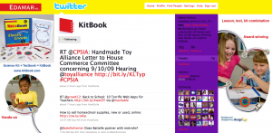
Previous Free Twitter Background Winner Showcase:

I use Photoshop on a daily basis, but not everyone is a designer nor can everyone afford it. Here’s a list of few free web based alternatives to Photoshop where you can either use them to create a new graphic from scratch or just do basic photo editing from your existing photos. I haven’t really used them to test all the features and tools, but I came up with the pros and cons based on my quick evaluation. First three are similar to Photoshop in a sense that you can create a graphic from scratch or open your own photo to work with. The last three are basically photo editing, meaning you will need to upload a photo to work with it.
 |
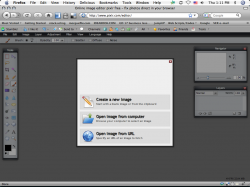
http://www.pixlr.com/editor/ – The interface looks almost identical to Photoshop. Has all the features that you would need to do basic photo editing. Recently released, so it’s still in its growing phase.
Pro: Loads really fast.
Con: Doesn’t have rulers or guides. |
 |
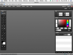
http://www.splashup.com/ – Looks similar to Photoshop, but is a little tricky to use. There are no rulers here either.
Pro: Interface similar to Photoshop.
Con: A little tricky to use. |
 |
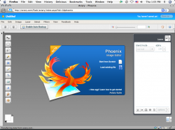
http://www.aviary.com (Phoenix Image Editor) – Was happy to see that this one has rulers and I can drag guides. Also has tutorials and explanations of the tools.
Pro: Easy to use, has lots of tutorials.
Con: Can’t think of any cons. |
 |
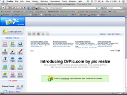
http://www.drpic.com/ – If you’re use to Photoshop, this one is a little hard to work with.
Pro: Has a batch resize feature (in more tools section below all the main tools).
Con: Takes a while to load, also has annoying ads. |
 |
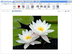
http://fotoflexer.com/ – Another photo editor that doesn’t really look like Photoshop but is really easy to use. Has ads, but if you click on the Full Screen mode all you see is the editor and no ads or browser toolbar. Have easy-to-follow tutorials to help you along.
Pro: Easy to use, great for scrapbookers.
Con: Can’t think of any cons (but I haven’t tried everything). |
 |
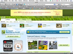
http://www.picnik.com/app – Another one that’s great for scrapbookers. Of course anyone can use it that needs to edit their photos, lots of cool features and effects.
Pro: Easy to use, looks like you can spend hours playing with all the features.
Con: Not really a con, but you’ll need to upgrade to premium to use all the extra features. |
There are a lot more, but these are the few that stood out. If you’ve used any of these and have your own pros and cons please leave a comment to share those with everyone.
 I’m excited to announce that I, Yiana Palacios am being featured in the Intelligentsia section of the CRAVE Los Angeles 2010 Guidebook and I’m giving one away.


 The best way is to look at your website’s analytics program and see what are your visitor’s browser screen resolutions. Take a look at the top two and based on that, you can choose what would be the best size for your background. Keep in mind that the smaller the resolution, the less space you have for design.