Website Critique: Factory direct craft
Factory Direct Craft, a family owned craft supply business was started by a stay-at-home mom. Now for over 20 years in business, the company has an online presence www.factorydirectcraft.com and ships their products worldwide. Striving for perfection in customer service, they wanted a video website critique with suggestions on how to improve their website.
| Limited time offer Free Video Website Critique for Small Business |
Branding should be the priority of every business small or big. Having a consistent identity throughout your print and online marketing materials will make your business more recognizable. Studies have shown that it takes at least 7 times for a prospect to interact with a business before they buy something.
Overall Improvements
• Make sure that your store, blog, and forum all look the same. You don’t want to confuse your customers with multiple identities. Not all your customers enter your store directly from the home page.
• Update the look of the website to bring it to today’s standards. Keep in mind your target audience at all times. Remember that you’re selling to creative people, so don’t shy away from bringing some creative style.
• Let a professional design your business logo and apply it across all your marketing materials.
• The top navigation should consist of the main categories that are on your website to make the shopping experience easier. The current buttons on the main navigation at the top are not the primary places where your visitors will go to shop on your site. These buttons could either be moved to the bottom of the website or made smaller and moved up next to the phone number.
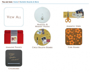
 • Create consistency with all your images in size and style. You can also make the images on your multi-product pages a little bigger, this will let your visitors scan the products easier (seeing details) and in return shorten the time to add to cart. To the right is a sample of a subcategory view from www.sortingwithstyle.com.
• Move the description text that you have on each category below the products, this will bring the products higher up on the page. It’s great for search engines to have descriptive text on all your pages, but the reality is that most customers don’t actually read that information.
Homepage
• There’s a lot going on and nothing is calling attention of the user to dig dipper in to the site. It’s best to focus on one main thing or offer and give a call-to-action, it’s sort of like telling the user I want you to do “this” next.
Shipping page
• Make it more organized and easier to read. For example take a look at the Macy’s Shipping Information page, it’s easy to read and to scan to find the specific shipping information.
• Personally I think that your shipping and handling charge is too high. You can have great products and they might be priced right, but just having a high shipping cost can make your buyer turn to your competitors.
More website critiques
Of course there are more things to review to make this website better such as search engine optimization, but this is a whole different subject and will require it’s own review.
If you’re reading this review and want to add more suggestions, please add your comments below.
Disclaimer
The video website critique and suggestions are for you to review and take what you feel will better your business website. There’s no guarantee that the suggestions mentioned will improve your business. Design Leap is not held responsible for any negative outcome.

