Website Critique: Elegant jewelry and crafts
Lorraine Davis, a jewelry and crafts designer has decided to start her own business and set up www.elegantjewelryandcrafts.com website to sell her designs. Designing jewelry and designing websites is a totally different art, below is a video website critique with suggestions on how to improve her website.
| Limited time offer Free Video Website Critique for Small Business |
In business, first impressions can make or break a sale, a connection, or even an opportunity. Websites are impressions of our business when we’re not there in person. Below are some further explanations and examples from the website critique video on how to make this website more professional and elegant as the name says.
Overall Improvements
• Set a style for your business and apply it everywhere. Let a professional design your business logo and include it on all your pages. Keep a unified look and color scheme that appeals to your target audience.
• Double-check, triple-check your links to make sure they are working and going where you intended them to go.
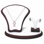
• Take professional photos of your products. If you don’t show your products as their best, how can you expect people to see their quality. Buy some jewelry stands and take photos against a white background, your images will look clean, unified and professional.
Homepage
• The homepage needs to have a call-to-action that prompts the visitor to do something: sign up for a newsletter, view gallery or anything else that you expect them to do. If you don’t tell them to act, they won’t.
• Remove 90% of the body text and replace with relevant information that the visitor wants to see.
Order Here page
• There’s no point to have a separate Order Here page. You need to combine your Jewelry page and Order Here page. When people browse your inventory, they want to know how much each item is and it’s information, they shouldn’t have to look for this information on a separate page. You can have a link from your gallery page that goes directly to individual product when clicked for more information.
Other recommendation
You might consider to sell your items on www.artfire.com, it’s a website where people buy and sell handmade products.
More website critiques
| Limited time offer Free Video Website Critique for Small Business |
Of course there are more things to dive deeply into making this site better such as search engine optimization, but this is a whole different subject and will require it’s own review.
If you’re viewing this review and want to add more suggestions, please add your comments below.
Disclaimer
The video website critique and suggestions are for you to review and take what you feel will better your business website. There’s no guarantee that the suggestions mentioned will improve your business. Design Leap is not held responsible for any negative outcome.


