Website Critique: Buy SD cards for cheap
Bringing competitive prices and great customer service is what the owners of www.sdcards4cheap.com are striving for. Knowing that they have a lot of competition to beat, they wanted a video website critique with suggestions on how to make their website better.
| Limited time offer Free Video Website Critique for Small Business |
Overall Improvements
• Show your visitors what’s your competitive advantage is more prominently.
• “Click Here for Help,” throughout the whole video I’ve been referring to this as a chat icon but I’ve never clicked on it. After I did the video I decided to click on it and to my surprise, it wasn’t a chat icon. Many online users expect certain things on the website to act the same on all sites. For example, it is common to click on the logo and be taken to the homepage of a website. As you can see from the video, by just looking at the “Click Here for Help” image, I was predetermined that it was a chat icon and many users might think the same way. Either make that image say “login for help” or something that doesn’t make one think it’s a chat icon or perhaps it would be a good idea to offer online chat support for your customers. Also, I believe that by making people login to get basic help, you will turn off a lot of visitors. Perhaps create a F.A.Q. section where all users can access the page.
• Think about adding your search bar a little higher so more people can see it easier and find what they’re looking for faster.
Homepage
• Currently the homepage doesn’t require the user to do anything, add some call-to-action to prompt the user to act.
• Add promotions or simply featured items so users can see what you’re selling right away.
• Having text on the homepage is great for search engines, but you need to add images and call-to-action that focuses on your target market.

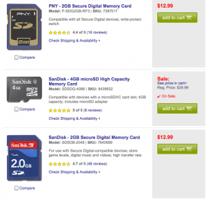
Best Buy product page
Product pages
• Make it easier for people to scan your pages and see the product names and prices.
• Create different color and/or size “add to cart” buttons.
• Look at your competitors and see what they’re doing right and follow their footstep (but don’t copy them exactly).
Manufacturers page
• When users click on a “Manufacturers” on the blue navigation menu (without selecting a particular item), there’s a list without images, make sure that you add images because it makes easier to scan through.
More website critiques
| Limited time offer Free Video Website Critique for Small Business |
Of course there are more things to review to make this website better such as search engine optimization, but this is a whole different subject and will require it’s own review.
If you’re reading this review and want to add more suggestions, please add your comments below.
Disclaimer
The video website critique and suggestions are for you to review and take what you feel will better your business website. There’s no guarantee that the suggestions mentioned will improve your business. Design Leap is not held responsible for any negative outcome.

